Babylon Health
Lead / Product Design manager
2019 - 2021
Designing an AI Healthcare Assistant
Casestudy #1
Summary
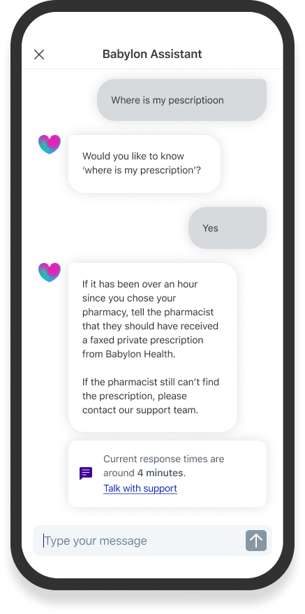
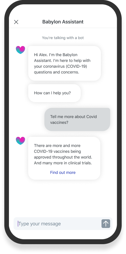
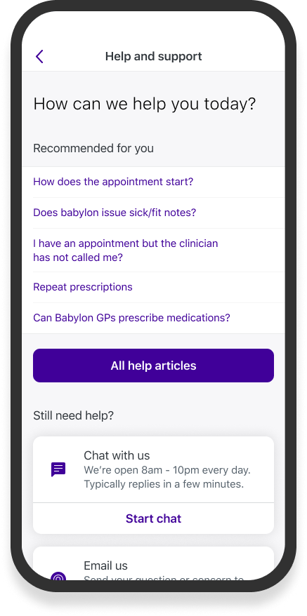
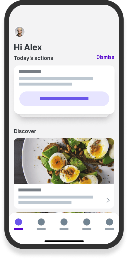
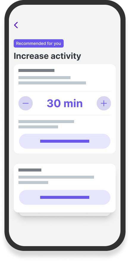
Babylon Health's mission was to deliver affordable, accessible healthcare to people worldwide. As Design Manager, I led a team of Product Designers, User Researchers and Content Designers to deliver a conversational AI assistant to help users with their practical healthcare.
Problem
At the outset of the project, I led a large-scale research project in Austin, Texas. We wanted to discover the challenges faced when dealing with the practical side of healthcare. Research uncovered several key challenges users faced:
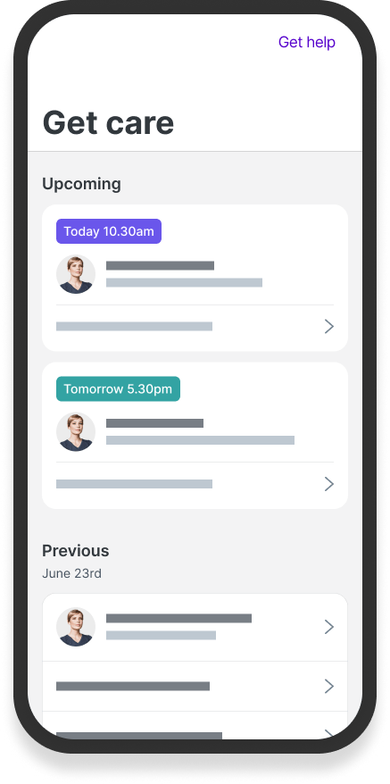
- Difficulty keeping track of appointments, prescriptions and test results
- Fragmented healthcare systems leading to disjointed information
- High cognitive load in staying organised
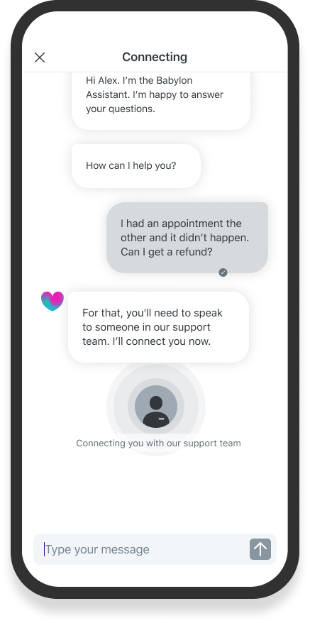
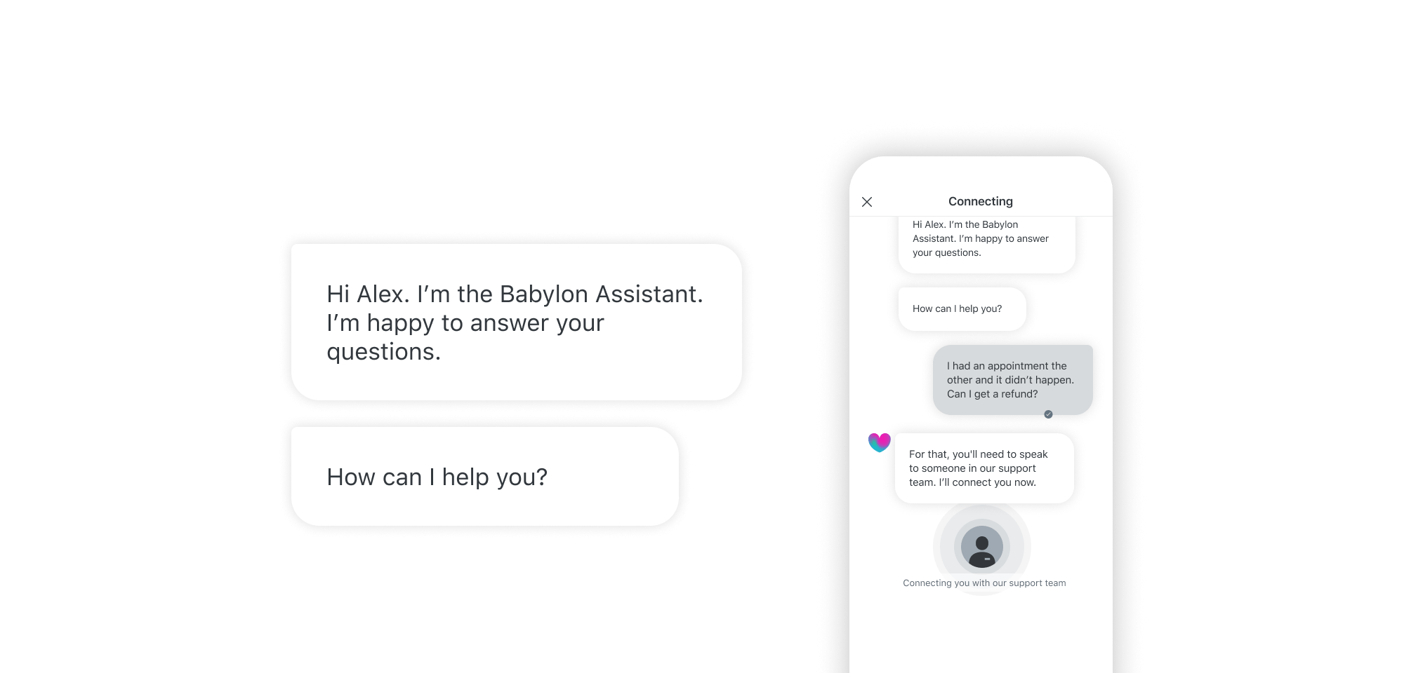
The goal was to design an AI assistant that could proactively support users with these practical needs, while also seamlessly connecting them to human support when required.
Approach
Our team's process focused on three key phases:
- Identifying critical moments of friction and disengagement across the healthcare experience
- Rapidly prototyping and testing to validate concepts and refine the Assistant's capabilities
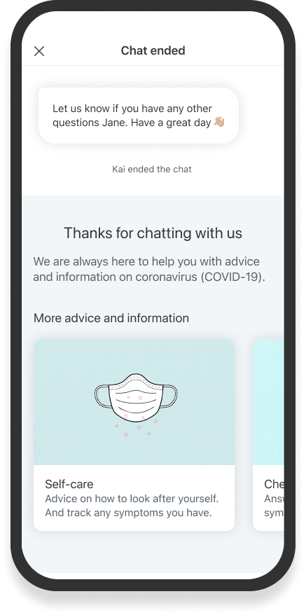
- Integrating human support seamlessly into the experience
A significant challenge was managing engineering constraints while delivering a new conversational UI alongside Babylon's existing design system. This required my close collaboration with product and engineering teams to prioritise features and phase development.
Solution
Our solution focussed on improving these problem areas in the user journey:
- giving contextual help when users needed it most
- connecting users to the service they need
- understanding why users drop out or disengage
Our key design principles focused on reducing cognitive load, providing timely assistance, and maintaining a human touch when needed. The assistant aimed to become a trusted partner in users' healthcare journeys.
Success hinged on working with different business areas. Negotiating engineering time, and supplying research feedback. And showing teams analytics to see areas of the service that weren't being met.
User interface and design system
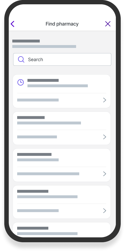
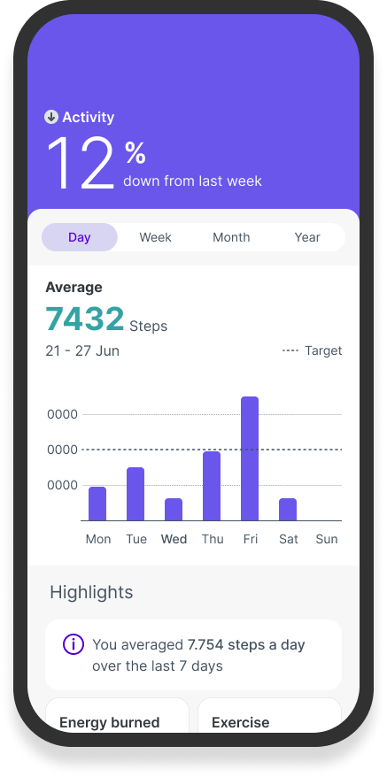
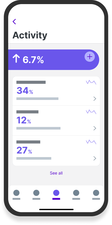
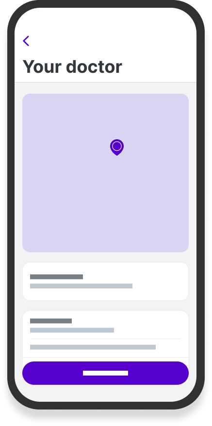
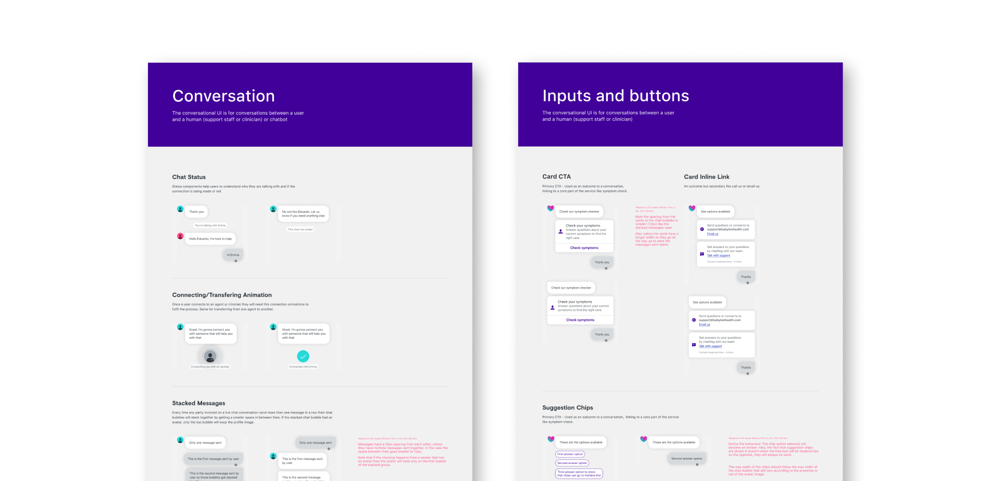
The team had to create a brand-new conversational interface, complementing the existing design system. While Babylon's original interface used a 'one thing per page' pattern for gathering health information, we needed a more fluid approach for natural conversations between users, our AI chatbot, and human support staff.
Managing both interfaces required a careful balance. I established regular component reviews with engineering and product teams to ensure efficient delivery while maintaining design cohesion across the platform.
Outcome
Within the first 6 months, the AI assistant made a significant impact:
- 19% reduction in the need for human support intervention in certain use cases
- Improved user engagement and task completion rates through the new conversational UI
- delivered a brand-new conversational interface, and contributed our components and patterns to the Design System
These results demonstrated the value of an AI-powered healthcare companion that could intelligently supplement human expertise. The project also offered broader learnings about designing conversational experiences for complex, high-stakes domains.
More reading on conversational design
- A blog post I wrote about giving users the right amount of conversational freedom
- A blog post I wrote about designing impactful conversational products with defensive design
A richer and more refined experience
Casestudy #2
Summary
Babylon Health was a pioneering global healthcare company, serving millions of people with a mission to make healthcare accessible and affordable. As Design Manager, I led a cross-functional team responsible for reimagining the company's design system and visual language during a critical period.
Challenge
In a rapidly scaling organization, design consistency had become fragmented across platforms. The teams mission, directed by senior leadership, was two-fold:
- Strike the balance between a clinical authority and wellness-focused business
- Create visual cohesion across all user interfaces while maintaining accessibility
Team: Jack Roles, Paul Tran, Fred Warbuton, Lily Batt, Adam Roller, Sebastian Petrina, Nora Toth, James Babrinda.
Approach
Working with a talented team of Product and Visual Designers, I developed a strategy for the direction of the project.
Setting foundations
The team began with a systematic audit of every component and element across Babylon's product. This gave us a clear picture of our current state and highlighted areas needing attention.
Creative direction
To guide our design evolution, we created mood boards that served both as a structural framework and a foundation for decision-making. This allowed us to consistently validate designs against our intended aesthetic.
Systematic development
I prioritised elements in a specific order:
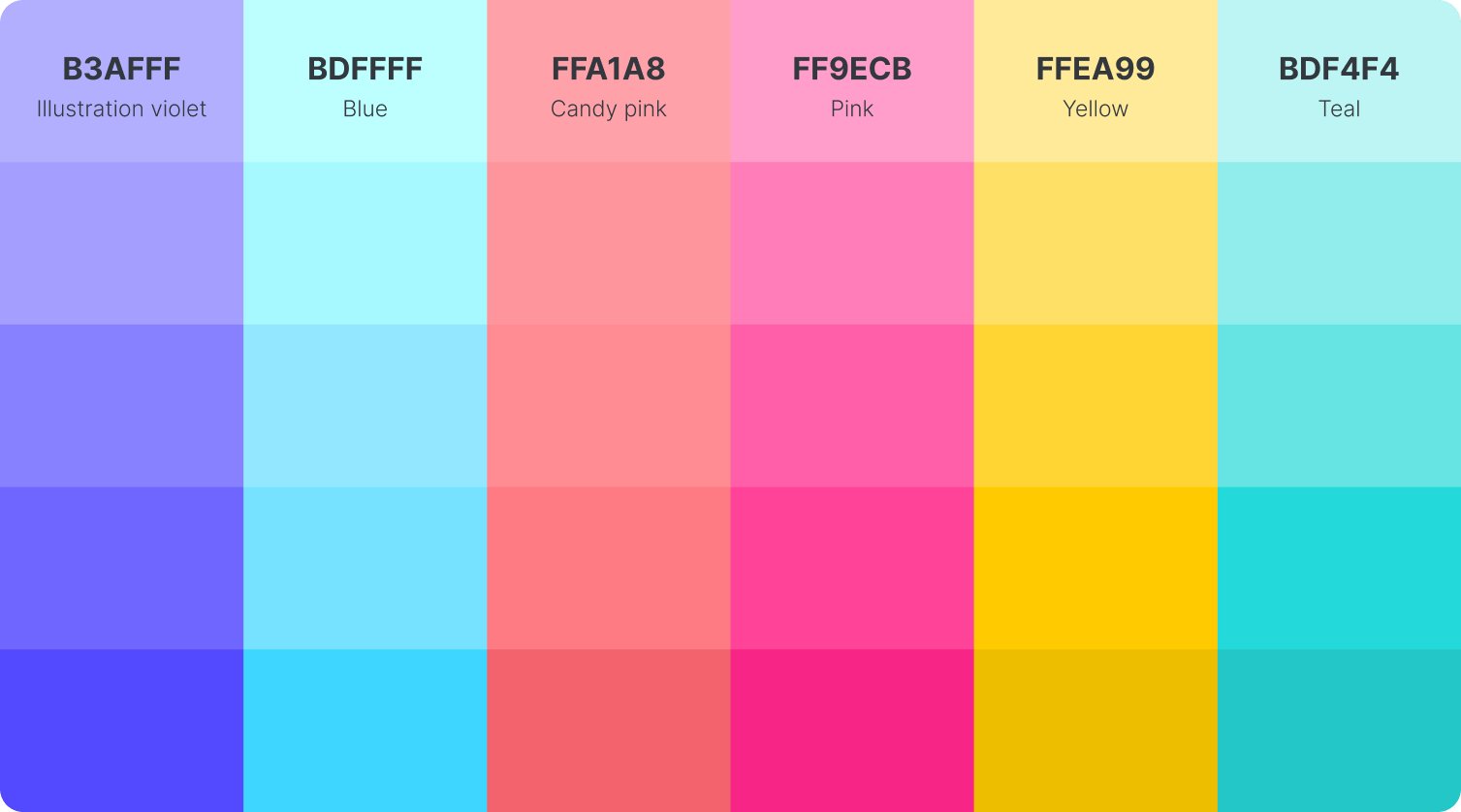
- Tackled color as the cornerstone of the brand identity
- Refined typography to add brand personality
- Developed elevation principles for depth and hierarchy
- Added cohesive shapes, illustrations, and animations
Solution
I created a protected space for creative exploration while managing leadership expectations. I delivered weekly updates to the Chief Product Officer and director of design. Throughout the project, I also facilitated open discussion with the broader design team and managed relationships across product, marketing, and brand.
After three months of exploration and iteration, we achieved a more sophisticated visual language that balanced clinical authority with approachability. This included a complete refresh of components, alongside a new color palette and typeface.
Outcome
The most rewarding aspect of the project was the organisation's enthusiastic response to the new design language. Despite high expectations from leadership, the team exceeded them, earning strong praise from both our Director of Design and Chief Product Officer. The success was a testament to the teams dedication and creativity throughout the project.
Senior stakeholders praised the transformation:
"It feels richer and much more refined, without being complex or overwhelming"
"Love the increase in details everywhere"
More
- A post I wrote about crafting a design language for hundreds of services across government
