Giving users the right amount of conversational freedom
In my previous post, I shared the importance of defensive design when creating conversational products. I want to expand on this concept using another aspect of conversational interfaces - affording users the right level of freedom.
Consider the typical digital interfaces we use every day in our apps and computers. They are structured and curated experiences. Designers attempt to take users down “happy paths” by giving clear options and signposts. Using buttons, forms, iconography and images to convey meaning and context to users.
Along came conversation
Conversation in daily life is anything but curated. A chat between friends can go down a million different avenues. Humans have spent thousands of years crafting face to face conversation. As we grow up, we learn how to communicate, including how to use body language and facial expressions.
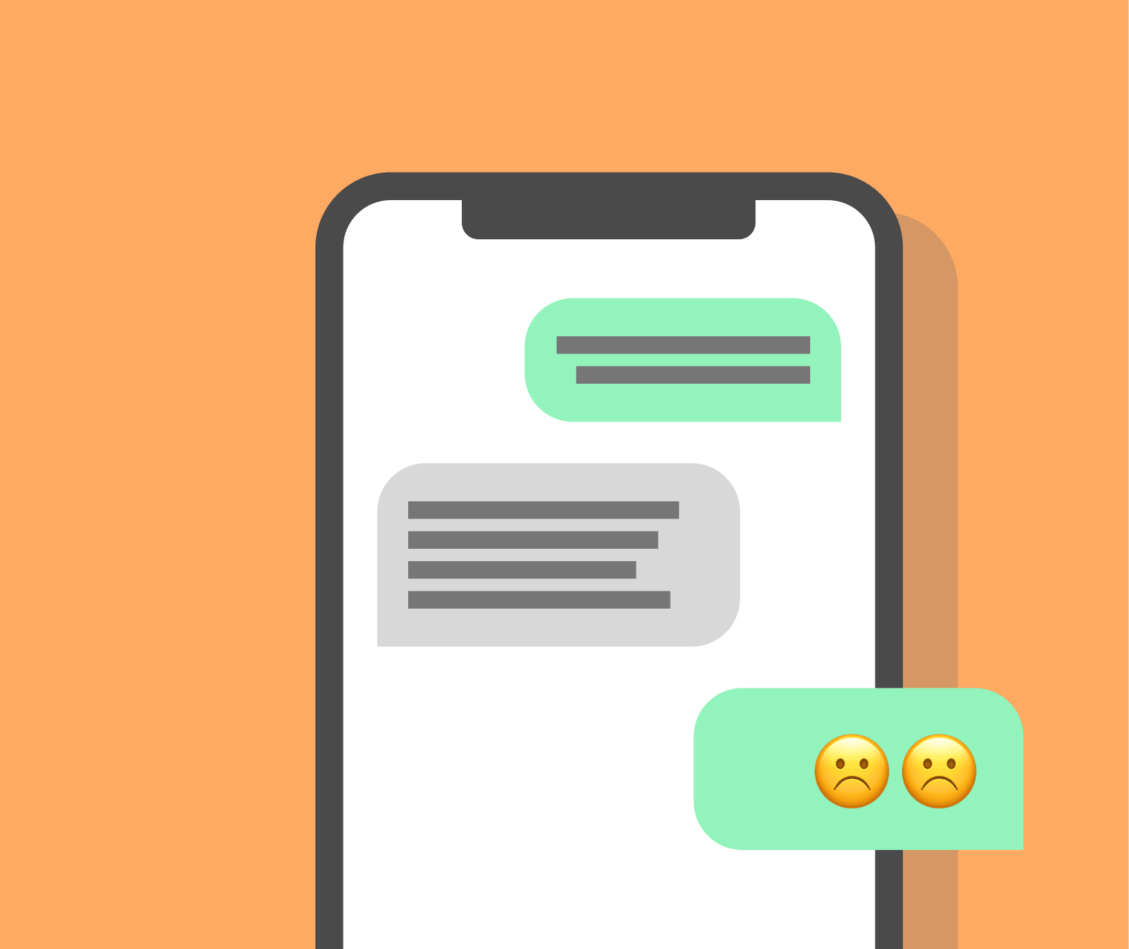
Conversational interfaces tend to be designed like real conversations. The possibilities are endless, which is in stark contrast to the curated form of a traditional interface. Affordances are lost in favour of conversational freedom.
They are popular for a few reasons, offering a more human form of interaction. They can convey caring and warmth to users. And help ‘contain’ users by helping them find the information they need. Instead of having to fallback to humans or other parts of a service. This is where freedom comes in. To contain users by meeting their needs with a bot, designers need to balance conversational freedom with curation. So users understand what the bot can do.
The balance of freedom
Looking at some of the more popular bots on the market, we see a variety of approaches to balancing freedom and curation.
The Google Assistant app takes a fairly curated approach. On first use it offers some options about what type of things you can ask. It also features a dashboard of helpful options. There are points though, where the only thing on screen is a text box and infinite possibilities.
The Amazon Alexa app is a less curated. On first use there is a small amount of onboarding and then it let’s users loose. A lot of the time Alexa offers voice or text input with no other interface elements which gives users very little help.
One bot on the other end of curation would be Amazon’s support bot. Most of the time it gives you limited options, not allowing you to enter anything you want.
Failure and containment
I have no idea about the amount of queries Google Assistant and Alexa fail on. But I can say with quite a lot of confidence that their technology's ability to understand users will be some of the best in the world. Most teams won’t have the resources of Google. So outside of big tech, designers need to pay particular attention to the level of curation.
Giving users too much freedom will lead to a strain on both your users and your technology. Users only enjoy freedom if they know what they need to do. Let’s use the example of buying a train ticket in a foreign country. If you can’t speak the language, you will lack confidence and won’t know how to ask for the right ticket. It is the same for conversational interfaces. Without guidance, users will struggle.
A goal of many bots will be to contain the user. But if the bot only knows a small amount of information, giving users freedom to ask anything will lead to a high rate of failure. Forcing users to find an alternative, like contacting human support or using another service. Or worse, going to a competitor.
I found a good example of containment failure researching on my current chatbot project in Texas. All our participants used Alexa, Siri or Google Assistant daily but a few noted that their main use of chatbots was limited. And they rarely tried new things. When talking with one participant, he told us the story of how he had found you could order an Uber in the chatbot he used. He did it once and it worked well. But he never did it again. When I asked him why, he said it was cool at the time but the chatbot never reminded him or prompted him about it again. So he forgot he could do it. And continued ordering Ubers directly from then on.
This situation probably wouldn’t go down as a failure. And so might have been overlooked. But it’s an opportunity for containment and delight that is currently being missed. A simple reminder about previous successful actions from time to time would meet this need.
Avoiding failure with curated experiences
The level of curation designers put into the experience should mirror the ability of the technology. If your natural language processing (NLP) can understand more, you need a less curated experience. Letting users loose with a blank text field and endless possibilities will result in a lot of users being misunderstood. Consider suggestions, hints, autofill and other options to help users.
No product can avoid failure. How you handle fallbacks and containment is another important area of focus. Fallbacks can be to human or offer alternatives that you can deal with.
Fallbacks also play an important role in bringing your brands personality into the experience. Users will remember how something fails more than the successes. Whatever your brand, whether it is caring, funny, or professional, make sure that comes in when you fail. How we help users, the language we use and the interface we create should reflect the brand.
There will always be a balance to find between freedom and curation. Following the principle of defensive design means taking a cautious approach. To allow for more signposting and curation. Helping users to understand the limits of the chatbot, rather than allowing users to find the limit and experience failure.
Back to journal