GoHenry
Lead Product Designer
2021 - present
70% of new customers choose GoHenry Plus
Casestudy #1
Summary
GoHenry, serving over 2 million members, is the leading debit card and financial education platform for young people.
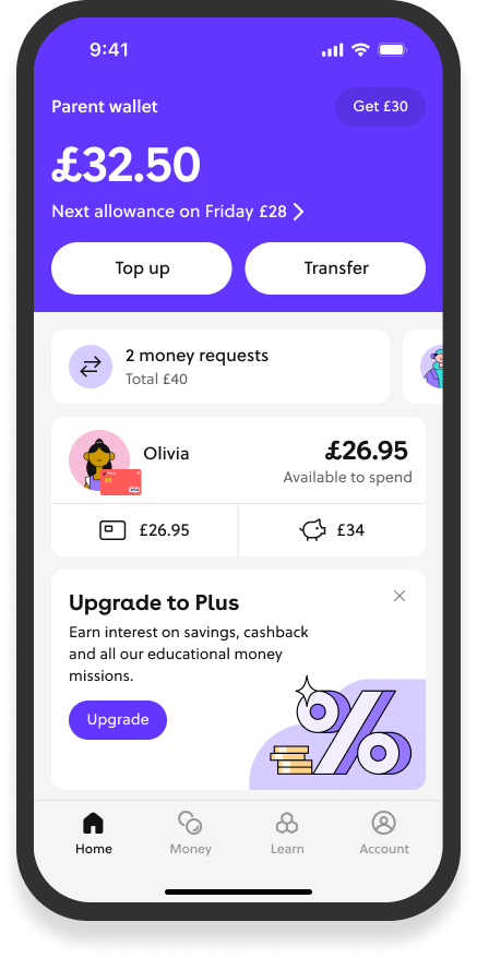
As a contract designer on the growth team, I led the design of GoHenry Plus - the company's first premium membership tier that would reshape their business model.
Problem
Growth design is a specific role within product design. While GoHenry had a successful core product, the business faced some key challenges:
- Growing competition in the family fintech space
- A need for revenue diversification beyond basic subscriptions
- Complexity of introducing tiered pricing without disrupting existing users
The growth team had completed initial discovery work on membership tiers, including market analysis and pricing research. My role was to translate these insights into a compelling premium offering that would drive adoption.
Approach
My growth design process was data driven. As well as diving into the existing research, I wanted to test multiple flows and screen concepts to drive conversions.
I wanted to base our approach on frequent iteration, using real-world behaviour. Rather than relying solely on qualitative feedback, we prioritized testing with real customers making actual purchase decisions to understand the true impact of design changes.
Solution
From the end of discovery to releasing a pilot took around 6 months. The final outcomes were:
- Membership Hub
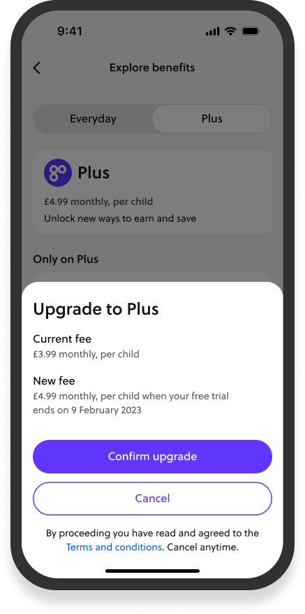
- Upgrade and downgrade journeys
- Consistent content
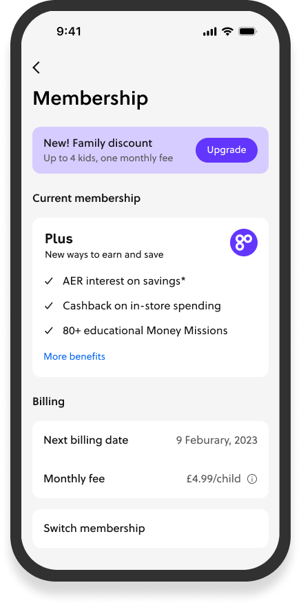
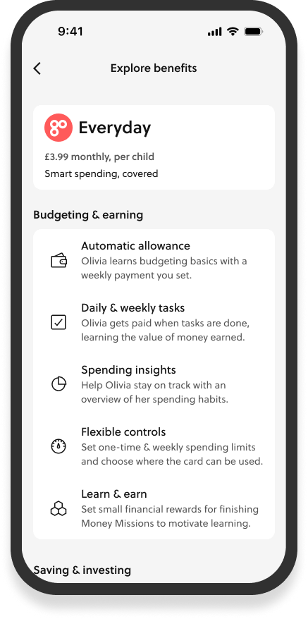
The membership hub was a new dedicated space for users to manage their subscriptions. I designed access to current benefits and billing information.
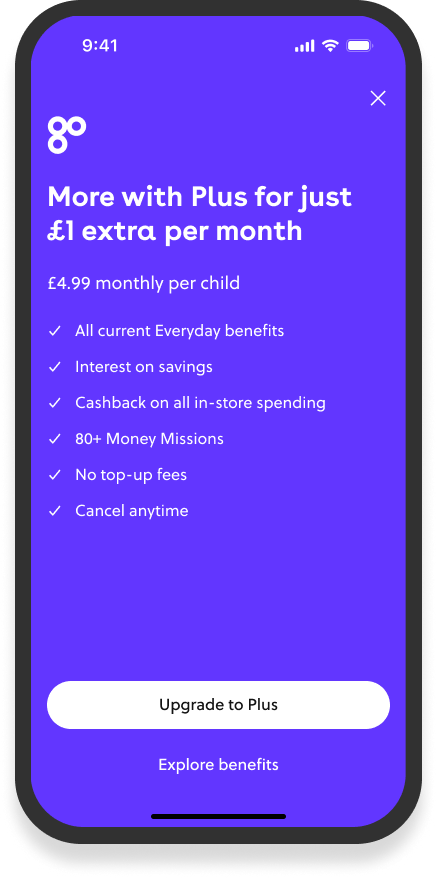
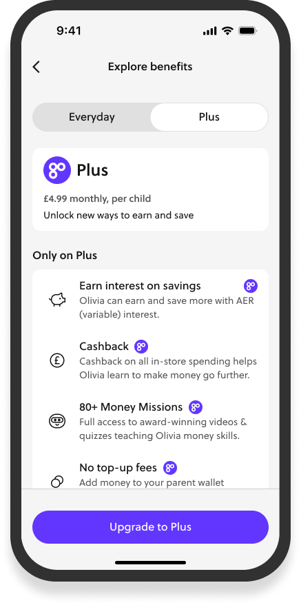
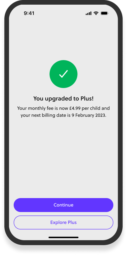
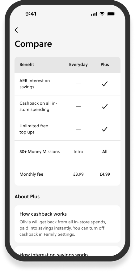
I identified key moments to present the benefits of the Plus membership for both existing users and in the sign up journey for new users. Created contextual prompts for features that were only available on Plus. And tried to remove barriers for both upgrading and downgrading.
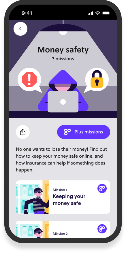
I worked closely with content designers to craft clear value propositions for the new features. As well as communicating the benefits of each membership at every point in the new user journey.
Outcome
GoHenry Plus exceeded all business targets within its first year:
- 70% of new subscribers choosing Plus over the basic tier
- 50% of total subscriber base upgraded to Plus
These results validated my design-led, test-and-learn approach and established a new revenue stream for GoHenry.
It reinforced my views on the importance of continuous testing in pricing and upgrade flows and how design can influence value in subscription models.
Redesigning GoHenry's core money movement experience
Casestudy #2
Summary
As Lead Product Designer on GoHenry's core team, I was responsible for the user experience that enables 1 million families to manage their kids finances.
The heart of GoHenry is it's ability to allow parents to send money to their kids.
Problem
Parents add money to their wallet in GoHenry and then pay their kids usually via a weekly allowance. We knew that keeping the parent wallet topped up was difficult for parents. Looking into the data:
- failed allowance payments were primarily caused by insufficient parent wallet balances
- parents wanted more predictability and control over money movement
- the existing auto-top-up feature wasn't meeting user needs, as evidenced by low adoption rates
The challenge was particularly complex because the parent wallet architecture was a fixed constraint. Any solution needed to work with it while ideally making it more simple to maintain.
Approach
My approach was informed by data and research. We spoke to parents who wanted to fund their accounts aligned with other bills and salary payments. We heard how the existing auto top up wasn't used because it led to unpredictable money movement. And how parents wanted us to help them understand how much money they should be putting into GoHenry.
I approached the design by:
- Mapping the existing money movement patterns and exploring how auto top up might be redesigned
- looking at salary trends across GoHenry markets
- how digital wallets like Apple Pay and Google Pay could be inttegrated
Solution
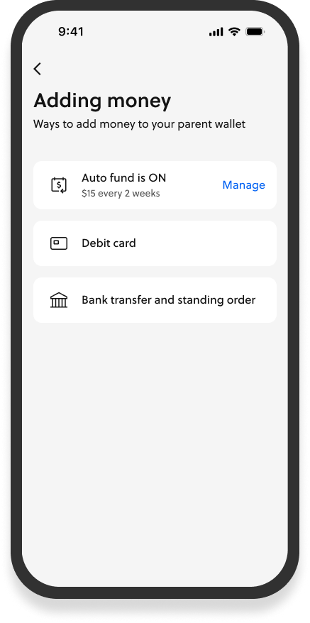
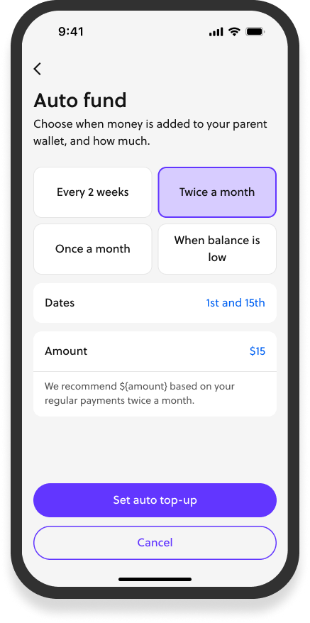
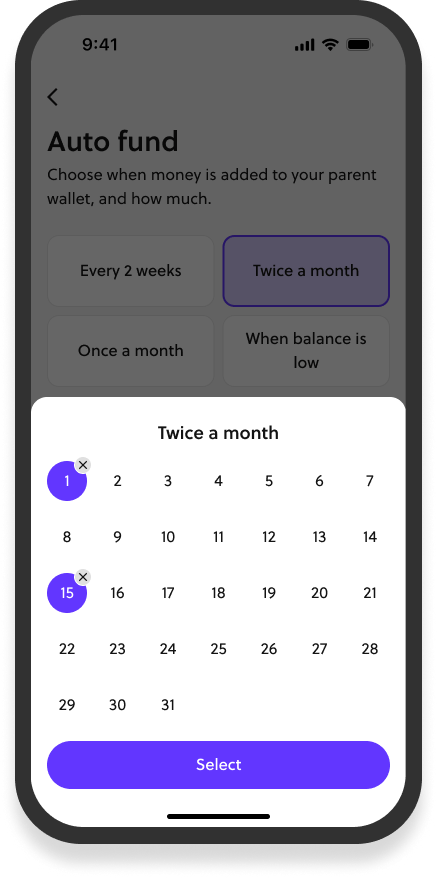
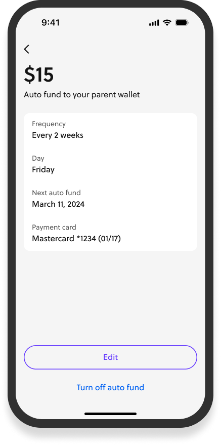
The final designs focused on a smarter way to schedule transfers into GoHenry.
Along with customisable transfer schedules aligned with salary patterns, I also designed intelligent top-up amount recommendations and better notifications.
The recommended topping up amount is based on the frequency of the top ups and the allowance set up parents have. This helped parents budget without having to do the math themselves on frequency and their kids allowance amounts.
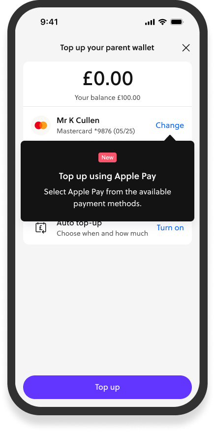
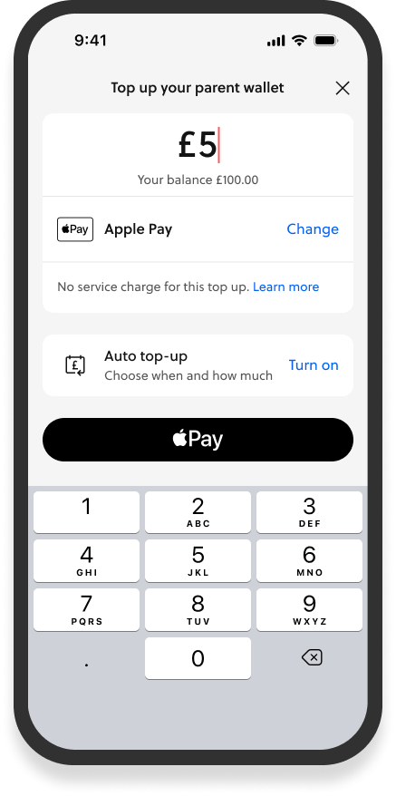
Apple and Google Pay
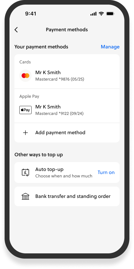
Related to this work, I also designed seamless integration of Apple and Google pay. This enabled parents to use it for auto top ups as well as enabling older GoHenry kids to pay with their phones.
As part of this I re-designed the management of payment methods.
Outcome
Though only weeks into the rollout as of November 2024, the redesign has already shown promising results:
- Increased adoption of automatic top-up
- More to come...
I learnt about the importance of adapting product behaviour to different markets. And how important itelligent deafults are, especially in a financial product like GoHenry.
